
Customer service departments of big companies engage with thousands of customers every day. Each interaction holds importance and the company can use it for their benefit. But the increasing number of these interactions means it is impossible to look at each one of them individually or to understand the individual customer journey. That is where Data visualization comes in. It can help customer-facing teams to improve their customer experience and point out the areas for improvement by using data analytics, and machine learning on customer data.
Marketing managers, sales representatives, and customer service professionals need to process a rapid flow of information to decrease the waiting time for every customer. It can also help them understand what customers need during these interactions. Organizations that use data visualization and business intelligence can obtain critical information 78% of the time, within the decision window, an improvement of 22% over organizations who don’t use these tools!We are going to discuss a few ways in which data visualization can help organizations do better when it comes to customer experience and overall customer satisfaction.
Customer-Interactivity
Only a few years ago, customer service was based on static texts and automated one-dimensional encounters. Today, the visualization of big data has taken customer experience between a company and its client to a whole new level of interactivity.
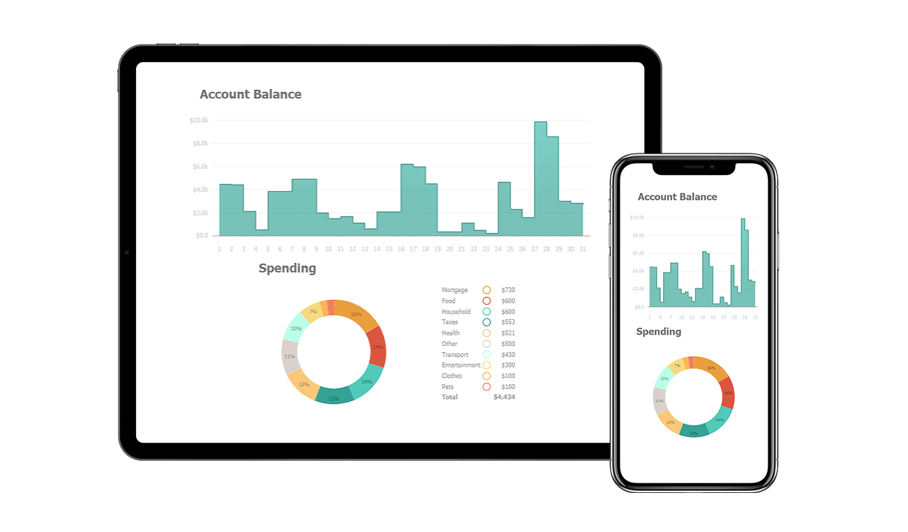
Businesses are using different visualization techniques that promote interactivity with their customers. One example of that is application (app) dashboards or live sessions that are operating in real time. They keep getting updates as the customers make any changes to any of the contributing factors. This helps them make a quick and better decision on how they want to do certain tasks which leads to better customer experience.Investment centers, credit facilities, and banks have added different data visualization techniques to help customers analyze their expenses. This could be in the form of a pie chart or trending graphs to differentiate between their spending and saving allocations. The concept is based on reaping the full benefits of the data present in a customer’s financial statements and creating a customer-centric design that meets their needs.

Analyzing Product Performance
Data visualization has played an important role in bringing the customer experience to a level higher than it used to be. Organizations have switched to visuals to promote their products by using a very user-centric design. Data visualization can help analyze the performance of a product or service. It can also help us address any issues with the product as reported by a customer. Data visualization makes it easier to recognize customer behavior trends about specific products or services. These data points give actionable insights so that we can change our business practices according to the choice of our customer.
Understand Data Consumption Objectives
With enough data present about the interactions with customers, data visualization tools can help customer service professionals understand and answer what data does a user need to access? When and Why? What is the smallest amount of data that will help answer the user’s question? These are some of the questions that data visualization answers.
Creating a Mobile First Design
An interesting application of data visualization is the integration of dashboards on a website. A number of businesses and industries are following this trend of showing their stats using a dashboard on their websites based on customer feedback and demand. Dashboards have also given rise to using an approach when designing a website or an app.
The Mobile First technique is exactly as it sounds, designing an app or a website design for the smallest screen and then moving your way up to tablets, laptops, and desktops. It is a good technique to create a responsive and adaptive design for an app or a website. With very small screens, it is hard to present the customer with their extensive but important data that is where data visualization comes in. It helps show important information which would otherwise fit a whole webpage into small responsive figures which can easily fit on a small display of a mobile phone. Customer analytics shows that mobile first leads to greater customer engagement and longer visits.
Identify Customers with recurring issues
Another goal of designing a better customer experience is to identify customers who are experiencing recurring issues. It is done in order to separate them from the rest of the customer interactions. Teams can attach unique codes to these individuals to keep track of their issues throughout their interaction with the company. Data visualization can help identify this data from other normal interactions and can help make it easier to communicate these customers individually and let them know the status of their problem. Visualization can also help later use this data to solve other recurring problems which enhance customer retention.
Data Visualization is gradually becoming an integral part of company operations as a means to understand big data. Nowhere is it more needed than in dealing with customer service complaints. This data has to be available in real time and analytics tools help to ensure that high priority customers don’t get missed. This enables customer service professionals to handle their interactions with customers in a better way, reducing response times, and providing more transparent communications.
Conclusion
Customer experience is key to modern business and Data visualization is a critical component to deliver consistent customer experiences. From the customer’s own interactions with charts, that enable quick actions, to employees and agents tools managing those customers in the most efficient way possible, many aspects of one’s business can be improved through leveraging these tools.
This article was originally published at JSCharting blog and republished here as part of content partnership program. JSCharting is a JavaScript chart data visualization library which includes over 150 advanced chart types plus interactive JavaScript stock charts, seamless JS grid, interactive calendar charts, JavaScript map charts, Gantt charts, gauges and micro charts.